Best Practices for Launching an Interactive Assessment

We launch hundreds of assessments each year for our customers and ourselves. In that time, we have learned a lot about creating effective assessments; what works and what doesn't.
Use this Guide as a Best Practice Resource to help you have the biggest impact with your next assessment.

Use the Landing Page to Show the Content's Value

The landing page of your assessment is where you showcase the value of the experience and set user expectation for what exists on the results page. 

1

Use the Landing Page to Show the Content's Value

The landing page of your assessment is where you showcase the value of the experience and set user expectation for what exists on the results page. 

2

Create a Seamless Journey for Visitors

Does the assessment title match the content that drove the user to this page? Design, imagery, and copy should match from one page to the next. Deliver on the user's expectation by keeping the journey from their original destination to the assessment seamless. 

3

Set User Expectation with a Time Indicator

Setting user expectation on the landing page about the commitment they are about to make is a great way to ensure they complete the entire assessment. Expectation can be made by showing the total number of questions or average time needed to complete the assessment.

4

Make the Purpose Clear

Ever land on a page and feel lost? The purpose of the page or call-to-action was probably hard to find. Put the CTA front and center so the user doesn't struggle with next steps.

5

Share the Benefit of Completing the Assessment

Tell your users why they should take the assessment with copy like “you will learn how…” or “get instant insight into…”

6

Entice the User with Additional Assets

Showcase additional relevant content that the user can unlock once they complete the assessment.

7. Create Content that Can Be Scaled Back for Mobile

Keep your content short and sweet for mobile users so the most important actions are kept above the fold.

8. Strip Out Unnecessary Content or Elements

To keep users focused on progressing, remove any extra icons, spacing, or text.

Assessment Questions

The Assessment Questions that Keep Visitors Engaged

The purpose of an assessment is to use questions to provide valuable information to participants. Here are our tips on how to create assessment questions that capture user attention and encourage them to complete the experience. 

Your Questions Should Be Written with the Results Page in Mind

The purpose of an assessment is to use questions to provide valuable information to participants. Here are our tips on how to create assessment questions that capture user attention and encourage them to complete the experience. 

Add Interstitials to Showcase Value and Keep Users Engaged

An interstitial can be added between questions that can include tips, supporting factoids, or stats that support the content.

Prioritize Content Above the Fold

Ensure that in mobile, your question and at least the first few choices are in view. Reduce spacing and extra imagery if needed. Deprioritize less necessary elements like the progress bar without removing.

Use a Progress Bar to Show the User What Is Left

A progress bar shows the user how far they have come in the assessment and what is left in order to complete it. Progress can be displayed as a bar that uses colors to show where the user is or as a number that shows what question number the user is currently on.

The Choices Are Just as Important as the Questions

The choices presented should help paint a clear picture of what value exists on the results page. It isn't always necessary to include 4 choices since some questions can be answered with only 2. Find the right number of choices for your audience and what will be presented on the results page through testing.


View this article to see the different ways to display your choices for your assessment. 

Best Practices on Choices

Give Your User Something to Write Home About

Your user should find clear value in your results. Whether it be a clear understanding of where they stand against their peers or detailed instructions on how to improve upon an area of their business, your results should give them something worthwhile. When your user finds your information useful, they are more likely to convert and share.

To Gate or Not to Gate Results - That is Always the Question

Whether or not you should require a form completion prior to the results page is just as important as the assessment itself. Gate placement is a great test opportunity, so experiment where it's placed in your assessment to determine what resonates most with your audience.

GET RESULTS  

Fill out the form below to unlock the result

We agree with you!

Use Visuals to Show the User Their Score

A visual score can help users see what they have accomplished and what they can do to work toward achieving a higher score. This is a great way to give users incentive to take the next action—contact you for services, download an eBook, or purchase your product.
Starter
Basic
Intermediate
Enhanced
Best-in-class

Show Your Expertise

Give the user tips on how to improve their score. Key takeaways can be a great place to show how your product or services can help solve pain points.

Interactive

2x

experiences

converts

more

Demand Metric, 2020

Focus On the Important Content

Hide any unnecessary content. Try to ensure that the results are above the fold. Consider adding a button or visual indication that the user can scroll to read more.
According to 2020 Forrester research, 76% of surveyed B2B practitioners and 83% of surveyed B2C practitioners find

Click to read more >

According to 2020 Forrester research, 76% of surveyed B2B practitioners and 83% of surveyed B2C practitioners find customer expectations for more personalized and digital experiences are greater than ever before.

< Close

Got Additional Assets? Share Them.

Once participants read through the infographic, they will want to learn more. Provide additional assets to keep users engaged and to move them further into the funnel.

Key Takeaways

We learned a lot of best practices in this guide!
Click on the boxes below to reveal the key takeaways from each section.

Landing Pages

  • Match the copy from the destination page to the assessment title and landing page
  • Make it clear on the landing page what the goal is and the value of completing it

Assessment Questions

  • Start with the result page when crafting your questions
  • Keep the choices simple and to the point
  • Add interstitials to share additional stats or key points

Results Page

  • Use visuals to show users what they have accomplished and what they can work toward
  • Test form placement to learn what resonates with your audience
  • Provide additional assets and key takeaways in order to encourage users to take next steps

Benefits of Assessments

Learn About Your Prospects

Learn About Your Prospects

Learn about your prospects based on their own behaviors. This data can be leveraged during sales calls or for future content opportunities.

Identify pain points

Identify pain points

Gather meaningful insights into user pain points and needs by their choices to the questions.

Personalized Experience

Personalized Experience

Create a more personalized experience for the user by only showing them content that is related to their needs.

Find an Infographic Quick Start

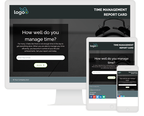
The Quick Start cloud includes over 150 Quick Start templates to help expedite your interactive content project. Under the assessment category, you will find dozens of Quick Starts that range from Report Cards that provide users with a grade to Easy Assessments that are built to launch quickly. Explore some of our assessment Quick Starts to find one that works for you!
ion interactive Quick Start Report Card with Dynamic Assets

Report Card with Dynamic Assets

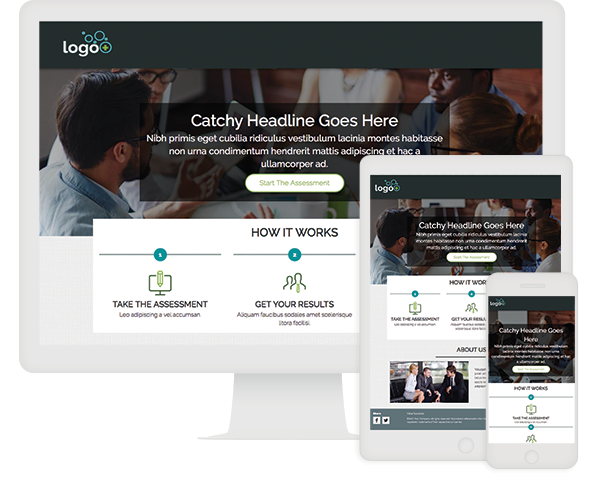
Use this Quick Start to uncover interest, intent and pain points while providing high value to your visitors. It starts with a low gate of just an email address and includes lead-gen calls-to-action on the results page. After the gate, your visitors step through questions to grade themselves on your report card topic. Visitors are then taken to the results page where resources are provided dependent on the score they received.
View Quick Start
ion interactive Quick Start 6 Category Assessment

6 Category Assessment

This 6 Category Assessment is for those marketers that are looking for a larger assessment. This assessment Quick Start is organized into six categories of questions — each category with its own progress bar to provide the visitor with expectations. The visitor is then taken to the results page, where they are not only given their final score percentage, but also the percentage scored in each category with suggestions provided. This is a great assessment to allow the marketer to collect all the data they need while breaking up the content into consumable chunks.
View Quick Start
ion interactive Quick Start Full Page Background Video

Easy Crawl-Walk-Run Assessment

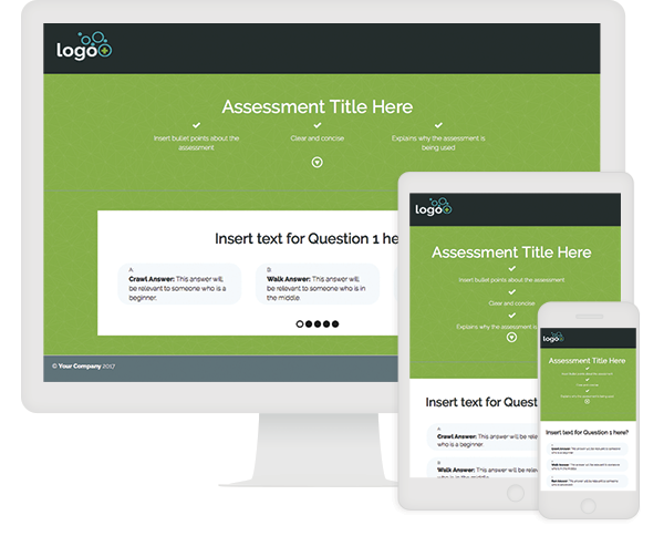
The Easy Crawl, Walk, Run Assessment is one of our “easy” Quick Starts, designed to launch in under an hour, with minimal or no training. This experience begins on a welcome page that shows the value of the assessment in three simple bullet points. The first question of the assessment is presented below the benefits list, allowing users to jump right in. Iconography guides the user to scroll down to begin. Users are encouraged to flow through the five-question, multiple-choice assessment.
View Quick Start
ion interactive Quick Start Report Card - Alternate Assessment

Report Card - Alternate Assessment

We’ve seen great success using report cards to get people engaged in assessing themselves. Use this Quick Start as the basis of your report card and uncover interest, intent and pain while providing high value to your audience. It starts with a low gate of just email address and includes lead-gen calls-to-action on the results page.
View Quick Start
ion interactive Quick Start - Easy Assessment

Easy Assessment

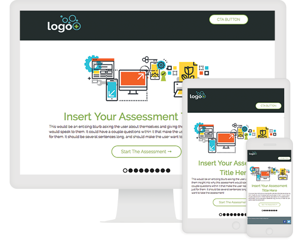
The Easy Assessment is one of our “easy” Quick Starts, designed to launch in under an hour, with minimal or no training. This assessment begins on a welcome page that provides the user with descriptive copy about the experience. A progress bar located below the “Start The Assessment” CTA will showcase how many steps the user will need to make in order to complete the experience. Users who begin the assessment will be navigated through a series of eight multiple-choice questions.
View Quick StartView Live Example
ion interactive Quick Start Customer Testimonials Page

Assessment

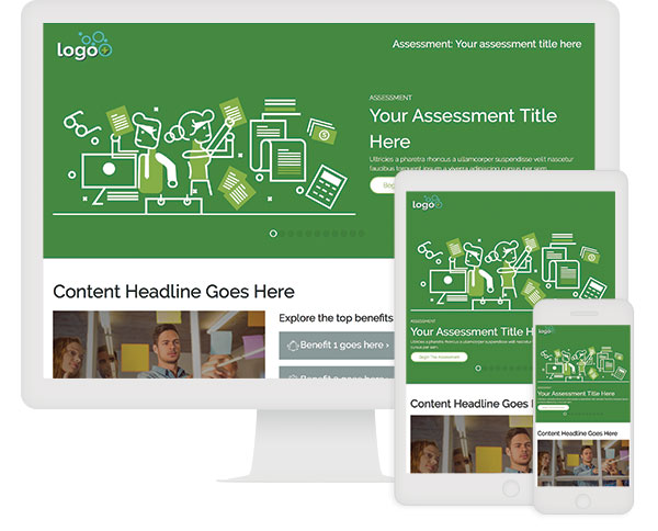
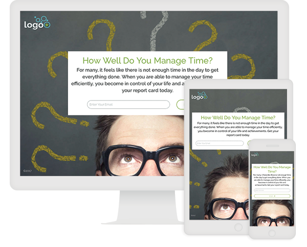
This assessment offers a great experience to increase brand engagement and educate your buyers! Visitors complete a set of questions and receive personalized recommendations at the conclusion. We’ve used the topic of time management only as an example in this quick start. You will replace the time management questions & content with your own theme, images and copy.
View Quick Start

Want more guidance?

We can help you strategize, design, and implement successful interactive content today. Get in touch with us to discover how our services can help your team.